Project 2
CS180/280A: Intro to Computer Vision and Computational Photography
Fun with Filters and Frequencies

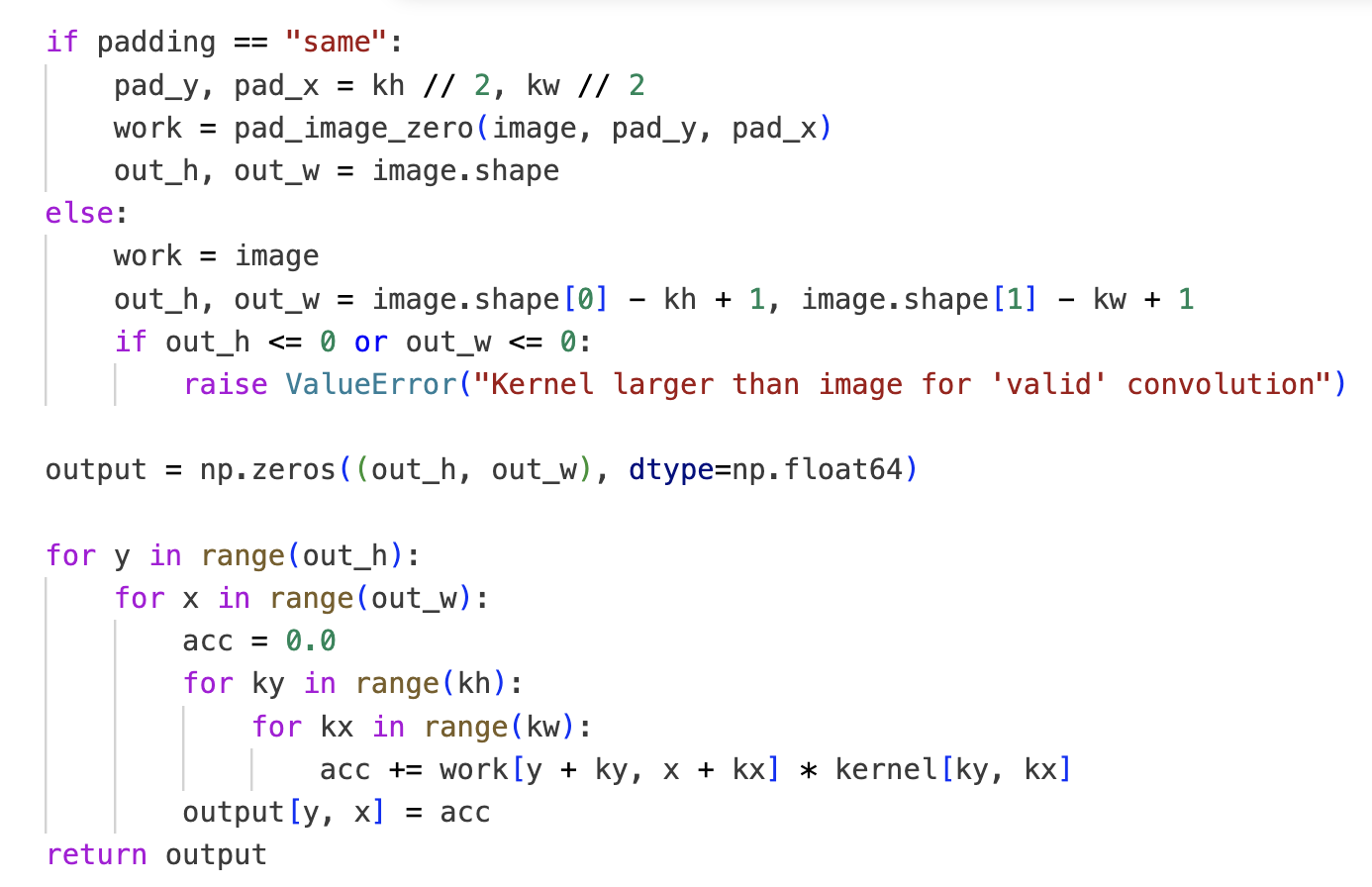
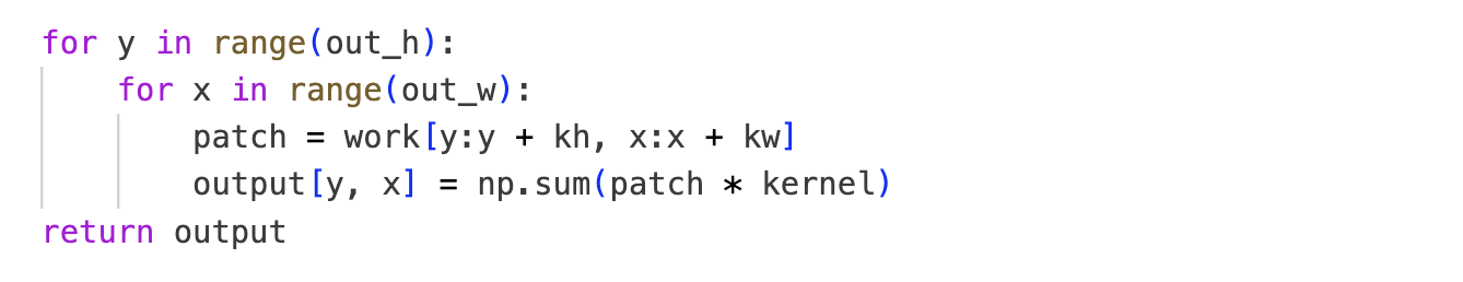
Part 1.1: Convolutions from Scratch!

Implementation
No worries, I use dark mode; I only switched to white for the screenshot so it better fits the website.
Boundary handling: I pad with zeros (fill missing pixels with 0). There are multiple valid approaches (as presented in lecture); I chose zero‑padding.
Runtime vs scipy.signal.convolve2d
- Box: mine 2808.88 ms vs scipy 108.86 ms
- Dx: mine 2440.96 ms vs scipy 11.06 ms
- Dy: mine 2666.32 ms vs scipy 14.91 ms
On a 960×1280 image, scipy.signal.convolve2d is way faster than the
pure‑NumPy implementation (I assume highly optimized C under the hood).
To verify correctness, I also rendered a difference image between my output and scipy’s; it was essentially pure black, indicating the results match numerically.
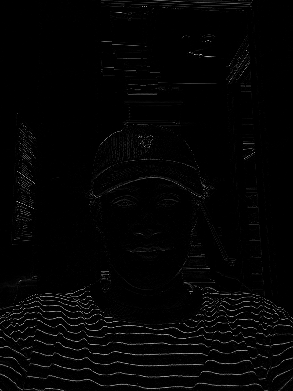
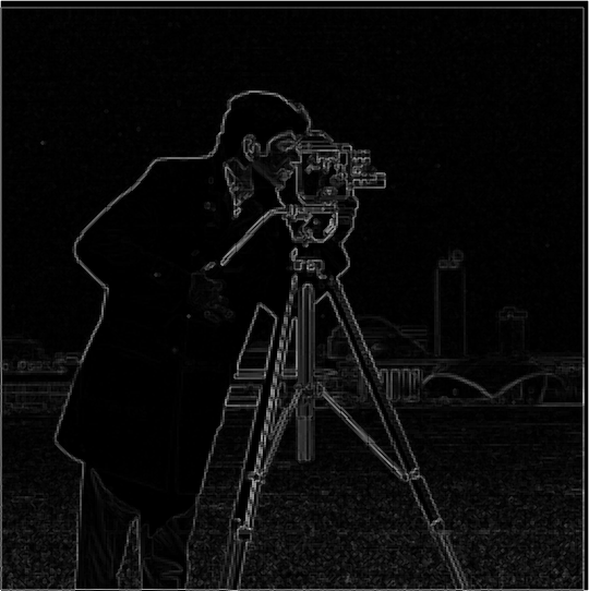
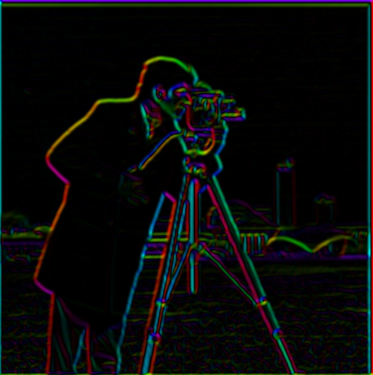
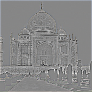
Part 1.2: Finite Difference Operator
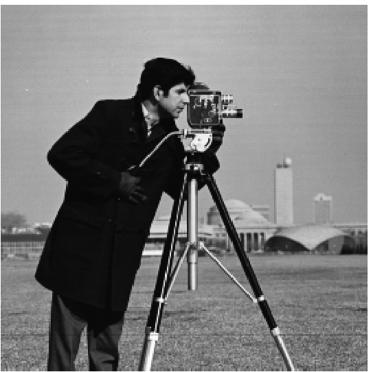
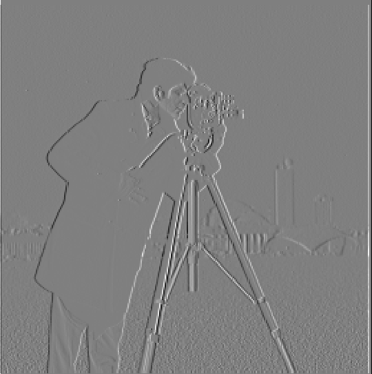
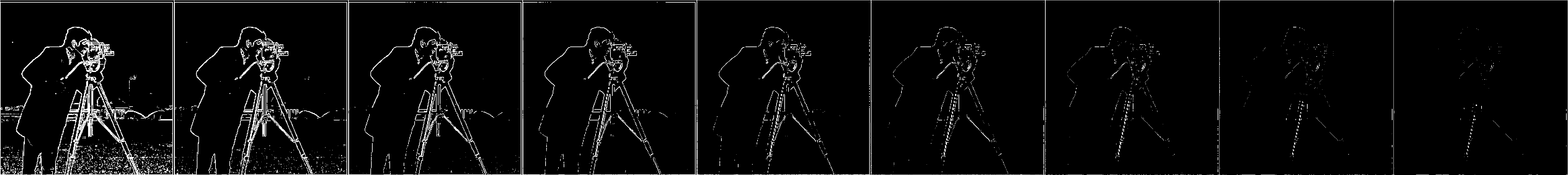
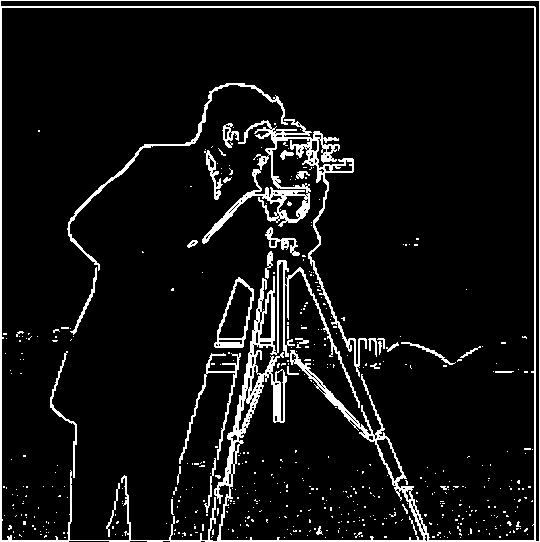
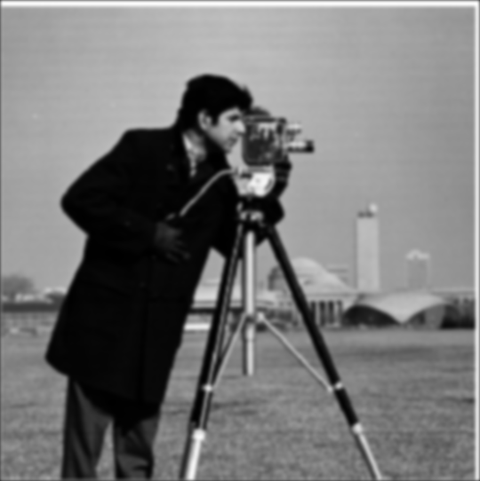
I chose a threshold of 0.15 to balance edge recall and noise. In the sweep above, thresholds at or below 0.15 keep the salient structures fully connected (e.g., the cameraman’s legs and the tripod edges). At 0.20, those lines already begin to break, indicating important edges are being cut off. Lowering the threshold further increases spurious responses in flat regions. Thus 0.15 is the smallest value that still preserves the silhouette of the cameraman and the camera while avoiding excessive background noise.
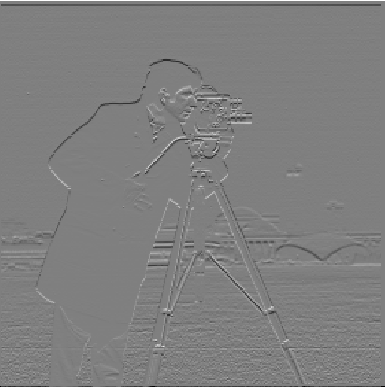
Part 1.3: Derivative of Gaussian (DoG) Filter

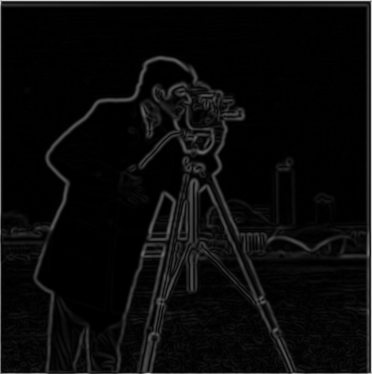
To blur the image, I used a Gaussian with a 9×9 kernel (odd size) and standard deviation σ = 2.


How the DoG filters were derived: Let Gσ be a Gaussian. The derivative‑of‑Gaussian filters
are the spatial derivatives ∂G/∂x and ∂G/∂y. In practice I obtain them by convolving the
Gaussian with the finite‑difference kernel [1, 0, -1] along the corresponding axis
(equivalently, computing ∂Gσ directly).
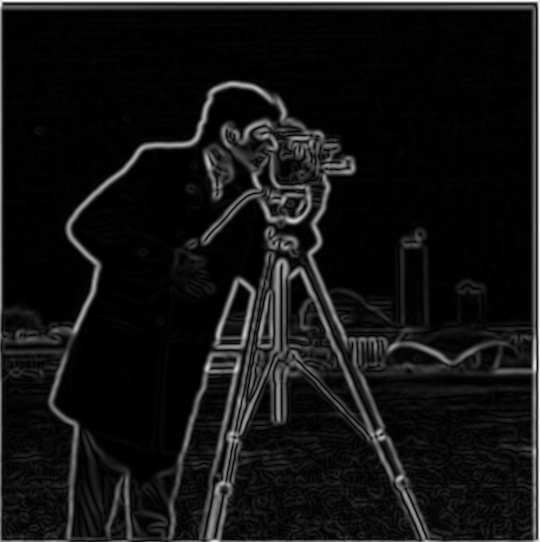
Compare: Gradient magnitude (DoG) vs Finite Difference
Drag to compare DoG-based gradients (1.3) with finite-difference gradients (1.2).
Comparison: With Gaussian smoothing + DoG, edges become thicker and often more visually prominent than with raw finite differences. Very thin, noisy edge fragments are reduced; broader but low-contrast boundaries (e.g., the crease in the cameraman’s pants) show up more clearly and continuously. In textured areas such as the grass at the bottom, the smoothing tends to blur away fine noise, keeping the salient structures while suppressing clutter.
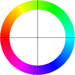
Part 1 — Bells & Whistles: Gradient Orientations (HSV)
Bells & Whistles: I compute and visualize gradient orientations on the cameraman image using only basic filtering and trigonometry (no high‑level feature/edge libraries). The pipeline:
- Gradients: Convolve with finite‑difference filters
[1,0,-1]and its transpose to get Gx, Gy. - Orientation: Map angle
θ = arctan2(Gy, Gx)from \([-π, π]\) to hue in \([0,1]\) via(θ+π)/(2π). - Brightness: Use a normalized gradient magnitude as the HSV value so strong edges appear brighter.
- Legend: Render a color compass (hue→direction with crosshairs) to interpret the colors.
This representation is useful because direction (hue) and strength (value) are shown jointly: thin/noisy responses stay dim while real edges stand out in both color and brightness.
Part 2.1: Image "Sharpening" (Unsharp Mask)
I implement unsharp masking in two equivalent ways. Let G be a Gaussian of size
GSIZE and SIGMA. The two‑step method computes a high‑pass and then adds it back:
The single‑pass method builds an equivalent kernel and applies one convolution:
I convolve per channel for color images and use same padding. The amount sweep
below shows how increasing amount enhances high frequencies; the “high‑frequency component”
panel visualizes image − blurred (contrast‑normalized) to make the boosted details explicit.
Parameters (first example): kernel size 21, σ = 2.0, α (amount) = 2.
Additional examples
Sample 0: original vs unsharp-masked.
Sample 1: original vs unsharp-masked.

Sample 2: original vs unsharp-masked.


Compared to the blurred input, the sharpened output is visibly crisper, but this comes at a cost in realism: boosted edges and micro‑contrast can make the image look a bit synthetic. Although it resembles the original, high‑frequency detail that was removed by the blur cannot be truly recovered; unsharp masking primarily increases local contrast around edges rather than reconstructing lost texture.
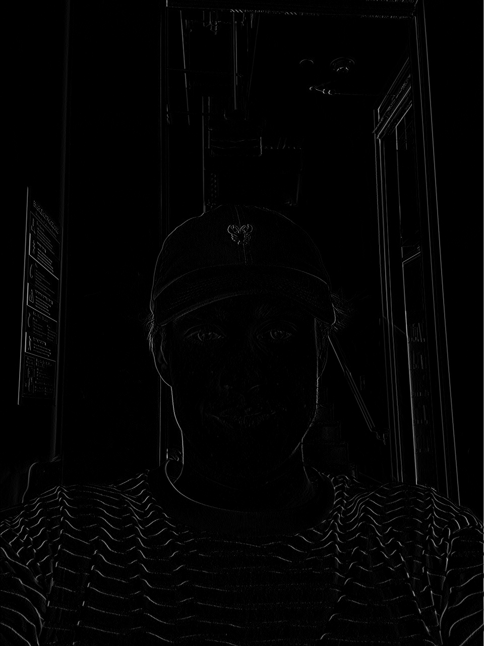
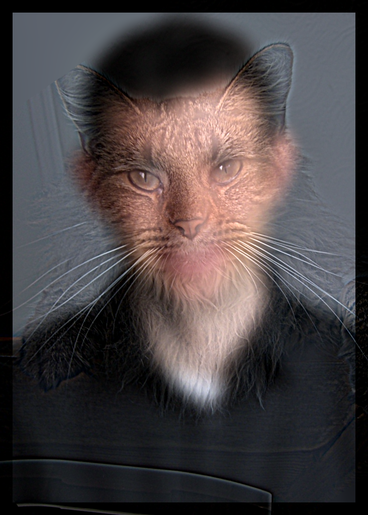
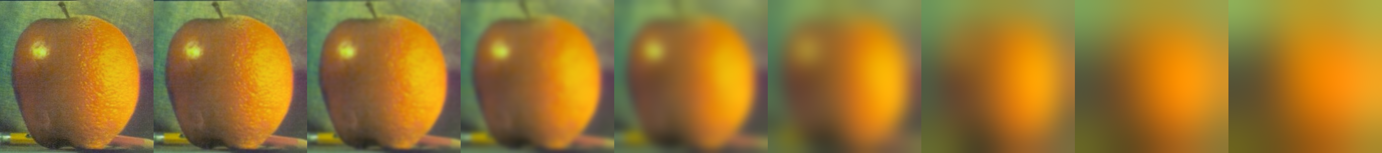
Part 2.2: Hybrid Images

Parameters (first example): low-pass kernel size 51 (σ = 6), high-pass kernel size 51 (σ = 7).
Cutoff selection: I chose the low‑/high‑pass σ values iteratively by qualitative assessment at near vs far viewing distances. If, up close, the low‑pass subject was still too visible, I increased the low‑pass σ to further blur it. If, from far away, the high‑pass subject dominated, I decreased the high‑pass σ so only higher frequencies remained. I repeated this simple adjust‑and‑look loop until the transition felt natural both near and far.
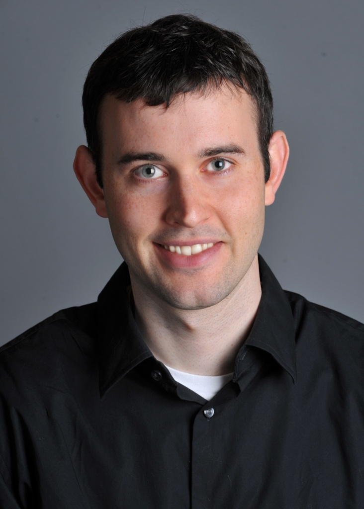
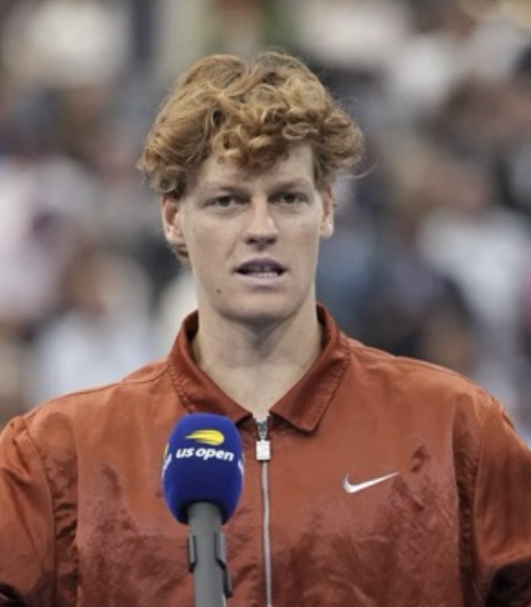
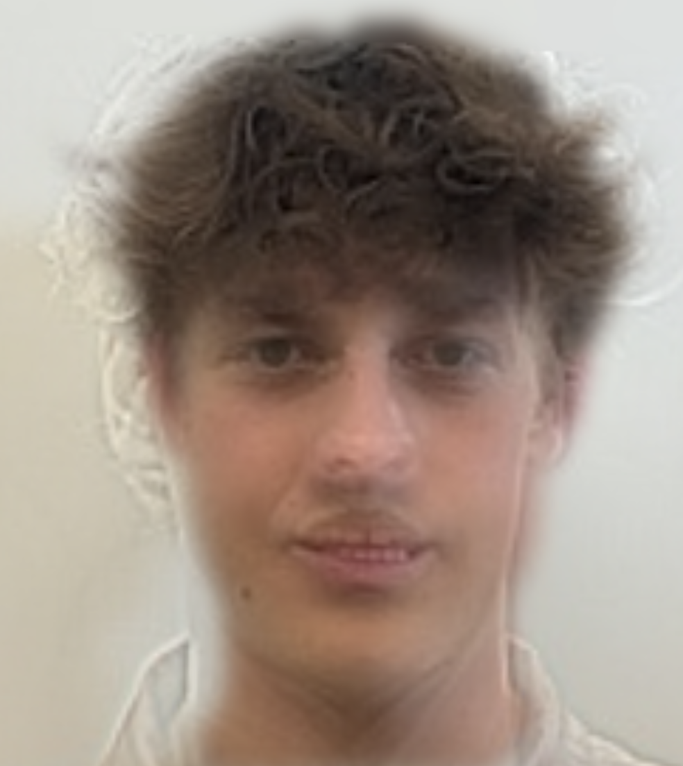
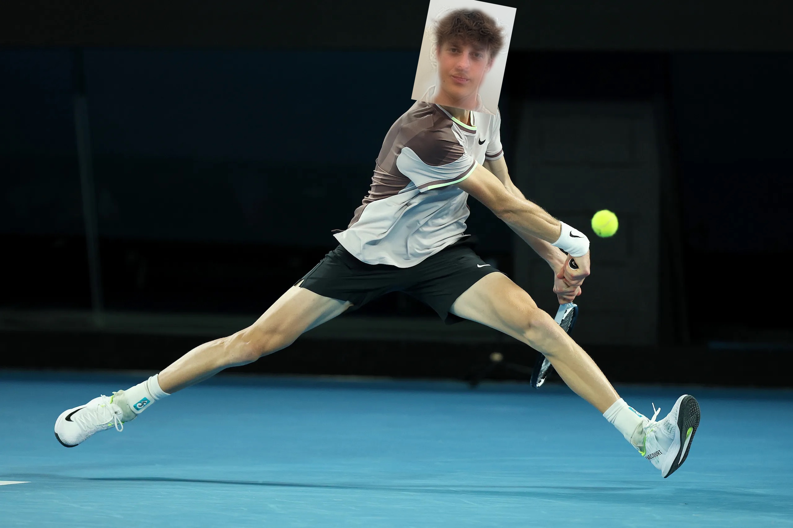
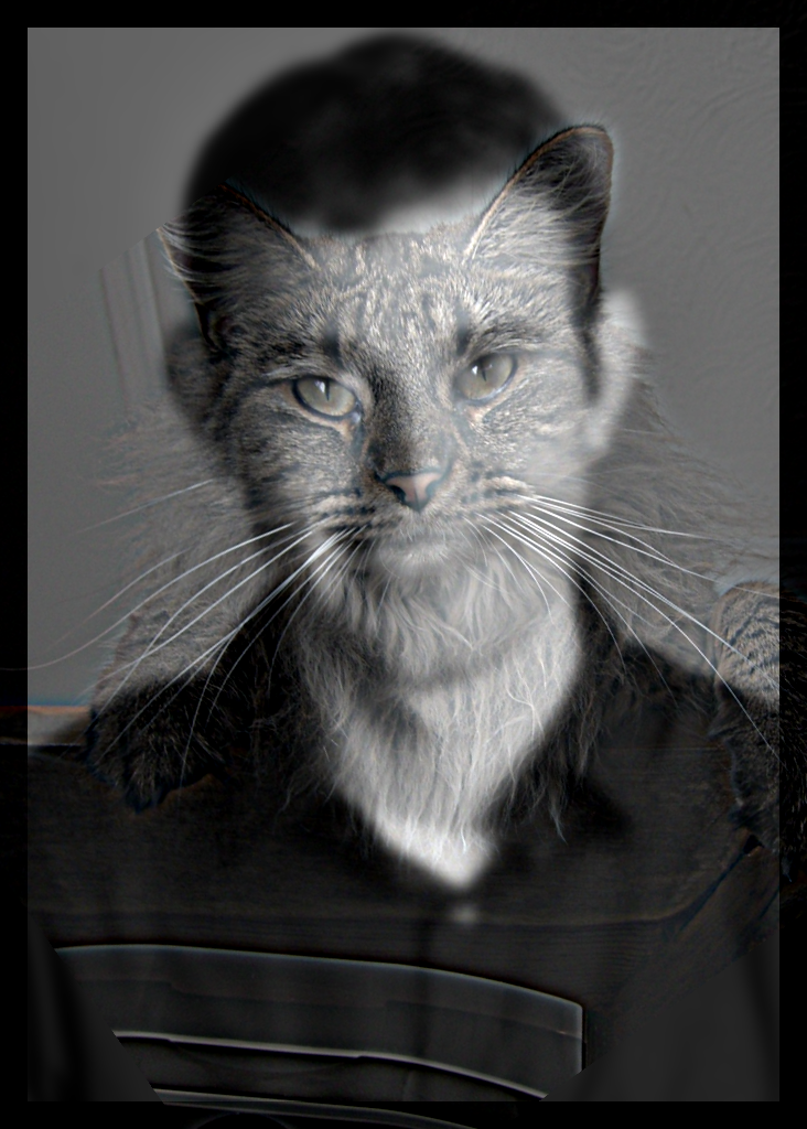
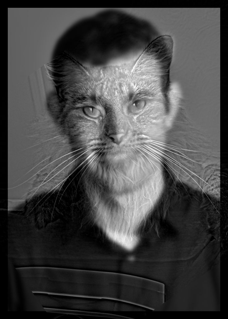
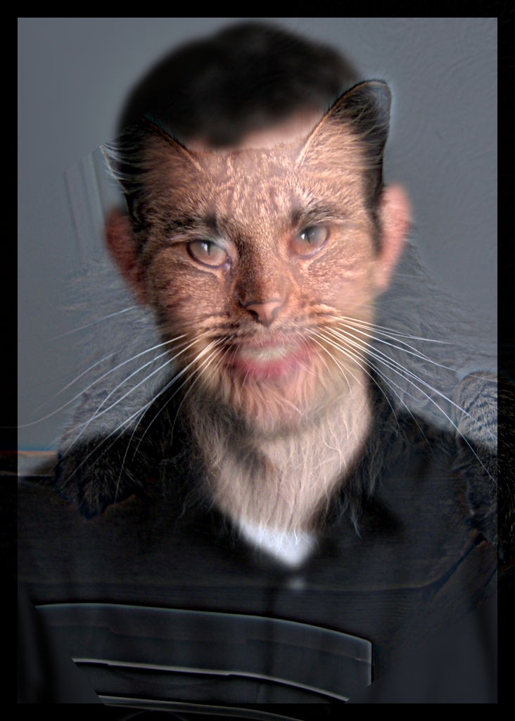
Example 2 — Sinner hybrid
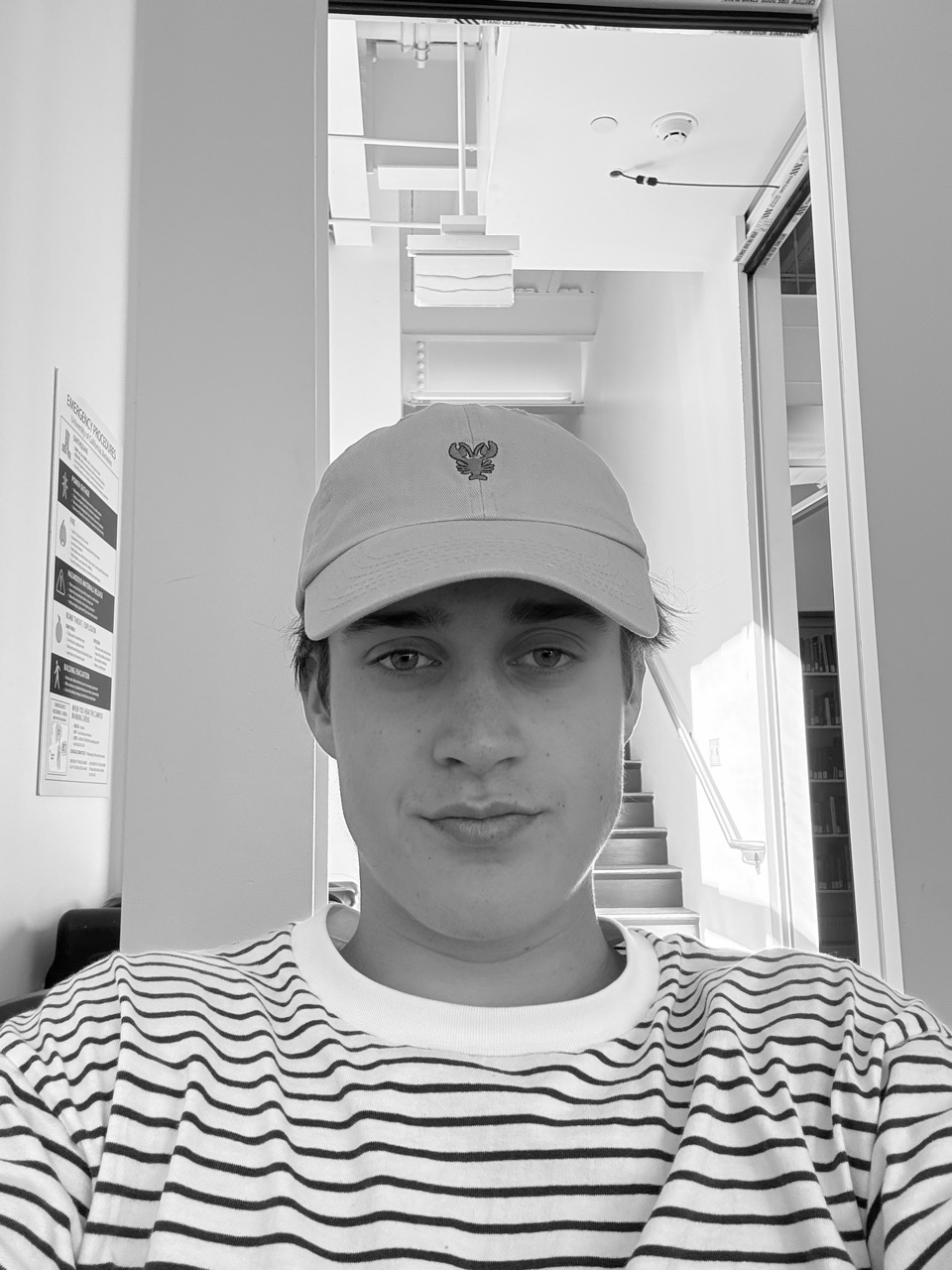
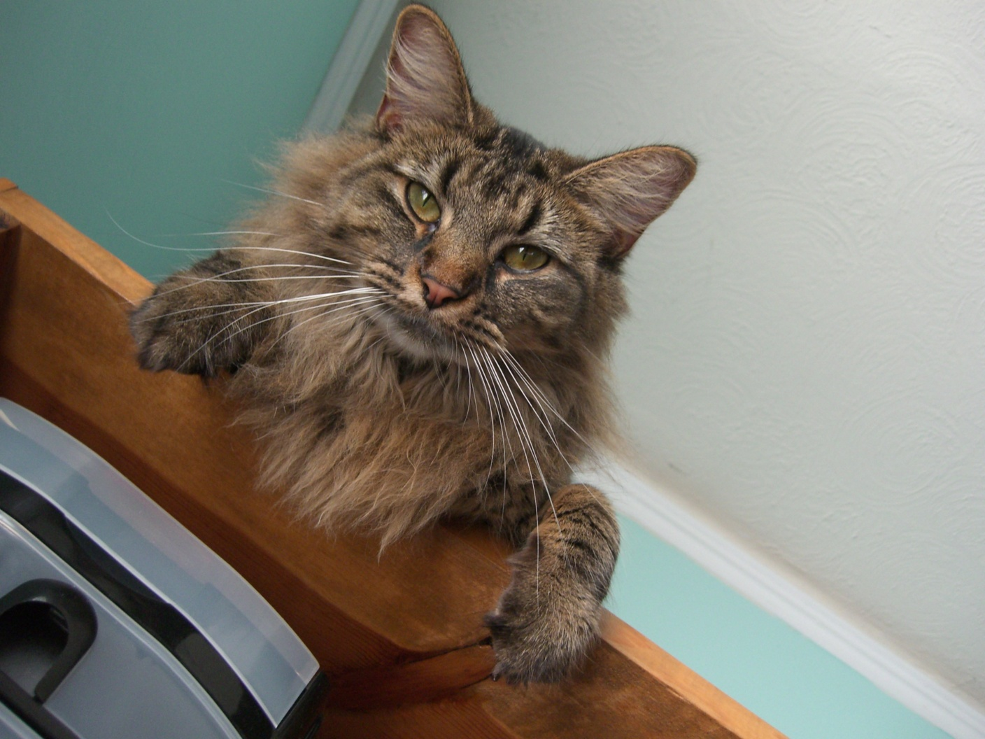
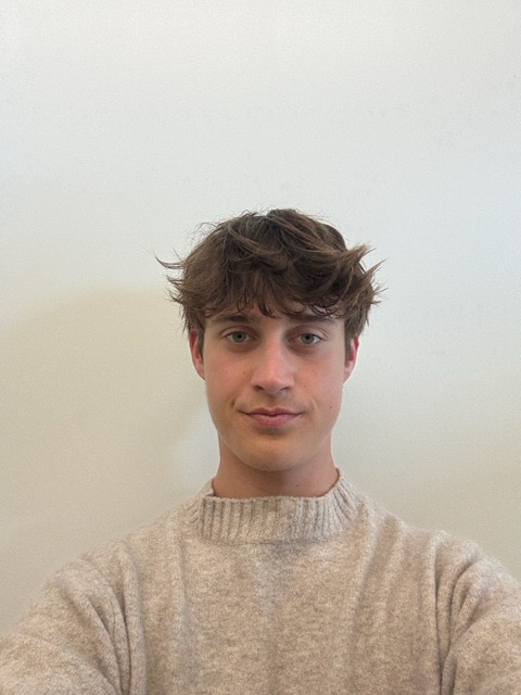
Inputs I chose for this example: Jannik Sinner and me.
Example 3 — Frequency analysis
Top: spatial images; Bottom: matching log‑magnitude spectra (FFT).
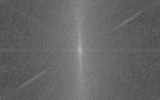
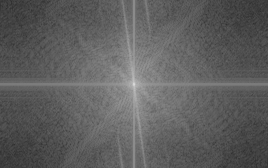
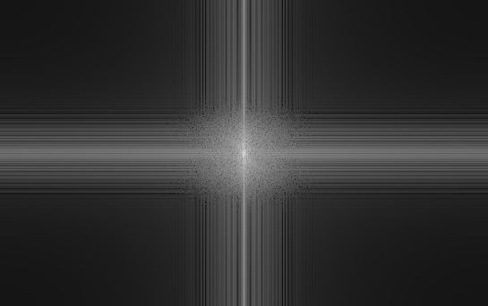
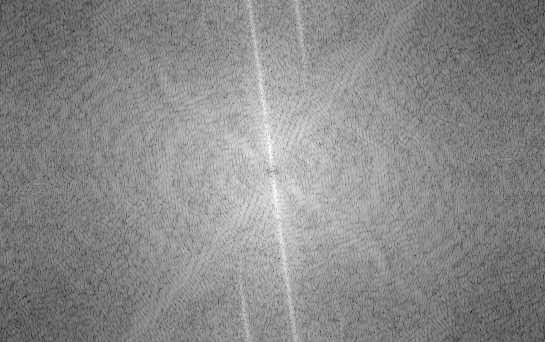
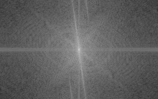
As seen in the spectra, the low‑pass and high‑pass bands are complementary; taken together they reproduce the hybrid’s FFT (up to display scaling in the log‑magnitude plots).
Part 2.2 — Bells & Whistles: Color in Hybrid Images

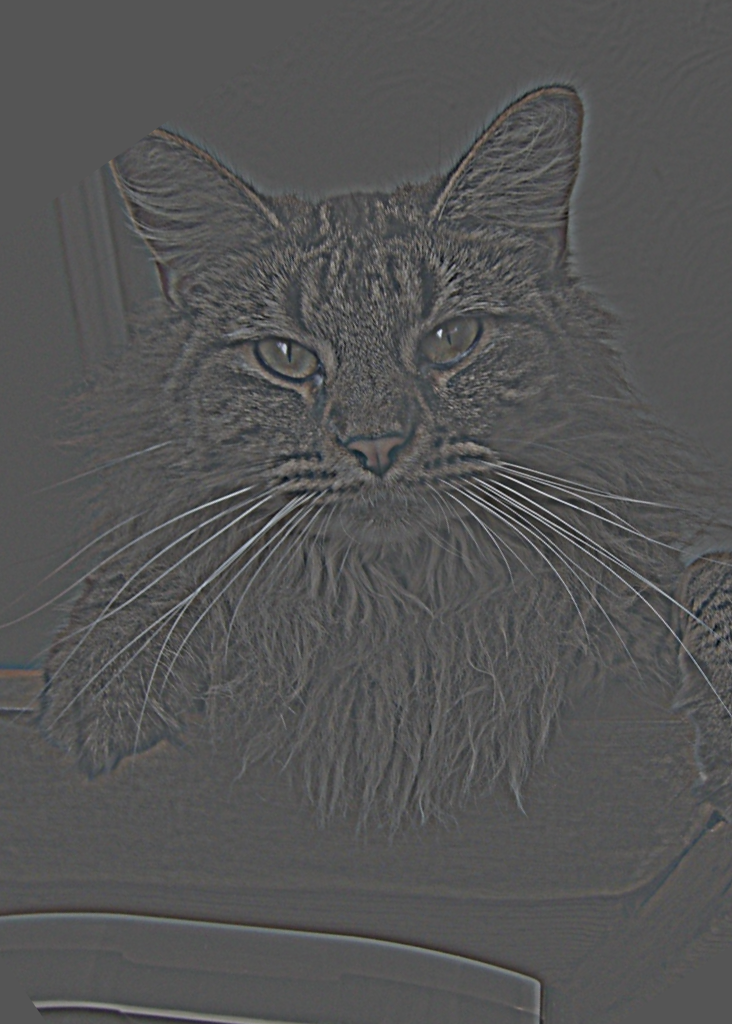
The high‑pass images do show color, but it does not dominate as much—the color mostly lives in fine details and small regions. By contrast, low‑frequency content tends to dominate perceived color because it captures larger shapes and thus fills broader areas with that color. When the low‑pass is color and the high‑pass is grayscale, the colored low‑frequency face tends to dominate perception; the grayscale detail rides along but is harder to parse because our attention is drawn to the large, colorful regions. In the opposite setting—high‑pass in color and low‑pass in grayscale—the effect works best for me: up close, the colored high‑frequency features from the cat pop and make that subject more present; as you step back, those fine colored details fade away with distance, and you cleanly perceive the grayscale low‑pass portrait.
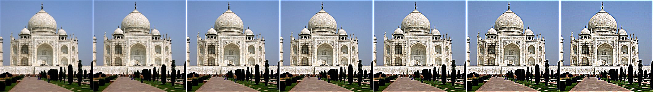
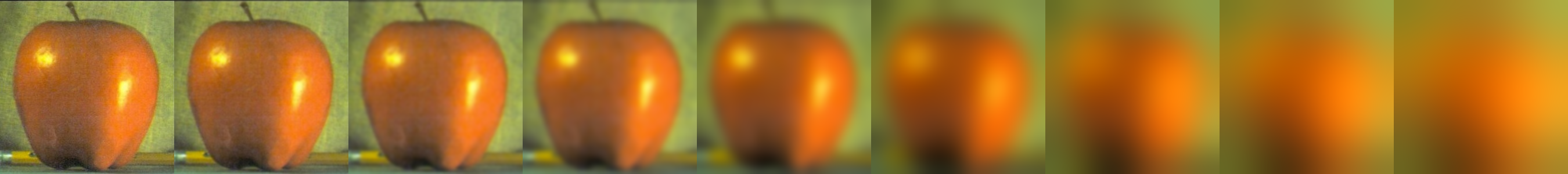
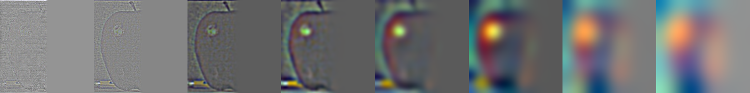
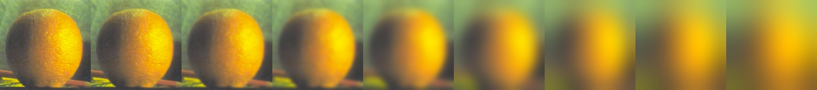
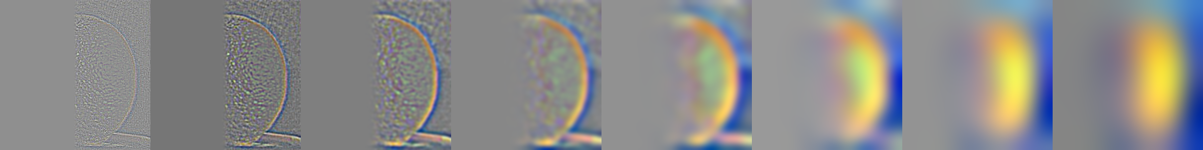
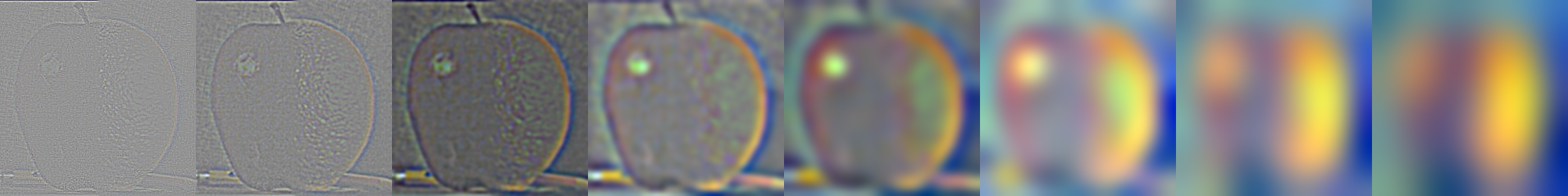
Part 2.3: Gaussian and Laplacian Stacks
Gaussian stacks (rows) are shown from left → right: the leftmost image is the original, and each image to the right is a blurred version of the image to its left with an increasingly larger Gaussian (kernel size grows each step).
Laplacian stacks are formed by subtracting neighbors in the Gaussian stack. Each Laplacian image is essentially the band‑pass content: the difference between a level and its next, so the leftmost Laplacian emphasizes the finest high frequencies, and moving right we step down in frequency content roughly one “octave” at a time.
The masked Laplacian rows apply the Laplacian at each level together with that level’s Gaussian mask. This reveals the actual frequencies that will be contributed when the masked pyramids are blended and reconstructed. I also include the Gaussian pyramid of the mask so it is clear how weights evolve across scales.
Parameters (first example): kernel size 51, base σ₀ = 1.0, growth factor = 2.0, levels = 8.

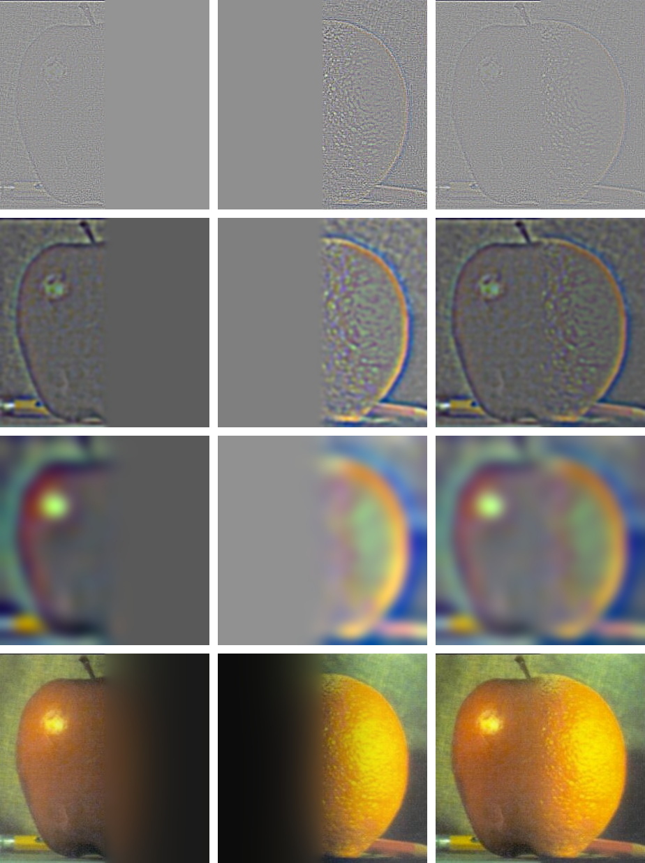
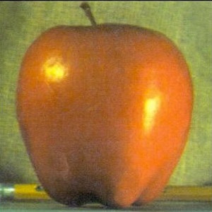
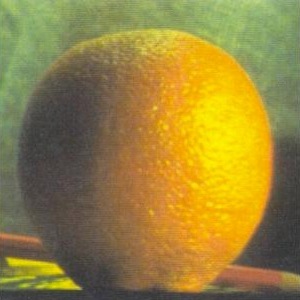
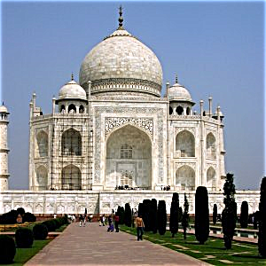
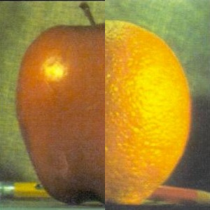
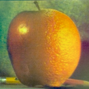
Part 2.4: Multiresolution Blending (Oraple)
Inputs (masked preview), final blend, and reconstruction grid.
The Gaussian and Laplacian stacks for the corresponding inputs and mask are presented in Part 2.3. Here, we reuse those pyramids to perform blending. In particular, the “blended Laplacian pyramid” row is the per‑level mask‑weighted sum (i.e., average/sum with mask weights) of the masked Laplacians from each input at the same frequency band. The final image is obtained by reconstructing from this blended Laplacian pyramid using the coarsest Gaussian level.
Parameters (first example): kernel size 101, base σ₀ = 1.0, growth factor = 2.0, levels = 8, mask σ = 2.0.
Example: Blending within the same image
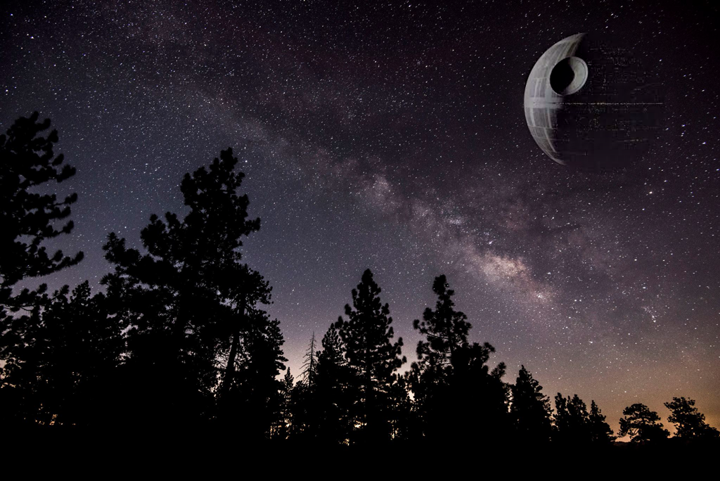
In-depth example
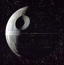
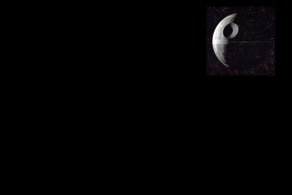
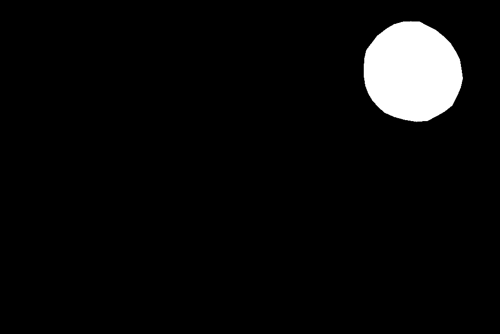
For this example I built a custom mask to composite the Death Star into a real sky photograph. The mask defines where each input contributes across pyramid levels, so bright mask regions pull in more of the Death Star while dark regions preserve the sky. The Gaussian mask pyramid and the masked Laplacians below show how the contribution tapers smoothly across scales, yielding a seamless blend.


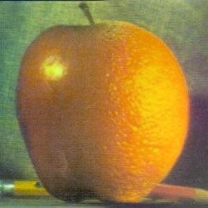
Part 2.4 — Bells & Whistles: Color in Blending
Instead of blending in display-encoded sRGB, I blend in linear light. Simple averages or mask-weighted sums performed directly in sRGB darken midtones and shift colours because sRGB is gamma-encoded (about ≈2.2; see sRGB). Inputs are converted from sRGB to linear light by the pipeline, which then constructs the Gaussian/Laplacian stacks and blends them before returning the output to sRGB for display. Each side appears more like its original as a result. In contrast to linearisation, which causes the apple's red to become noticeably darker after blending, linear-light blending preserves the apple's red tone nearly exactly.

Most Important Thing I Learned
I greatly enjoyed this project. It gave me a much deeper, hands‑on intuition for frequencies in images and how they shape perception.
An image is not just a grid of pixel values—it is also a multi‑scale frequency composition. By manipulating different bands (low vs high), we can dramatically change how an image looks and what the viewer perceives: sharpening boosts local contrast, blurring suppresses fine detail, hybrids reveal different subjects at different viewing distances, and multiresolution blending shows how scale‑aware masks control what survives across levels. I wasn’t fully aware before this project how strongly frequency content—and the fact that some bands can be effectively invisible to humans at certain distances—controls what we actually see. Coming from a machine learning background, I wasn’t aware that this kind of image manipulation is possible with such comparatively simple, classical signal‑processing techniques.